LOCAL POINT
Branding for a Foreign Language School in Moscow

| Victoria Savkina is a Chinese language teacher by education. While she has been running a business for many years, she always finds time for her passion—teaching Chinese to those fascinated by Eastern culture. With 15 years of teaching experience, internships, and work in China, as well as expertise in international teaching methodologies, it was only a matter of time before she opened her own language school in Moscow. In the fall of 2020, despite all the risks associated with offline business, Victoria and her friend, an English teacher, decided to bring their dream to life under the brand LOCAL POINT. |
Language schools often look alike—many lack modern teaching methods and fresh, forward-thinking educators. However, standing out in the education market requires more than just delivering quality knowledge; atmosphere and presentation matter just as much.
While language courses are available in every neighborhood, spaces for cultural exchange and meaningful communication are rare. LOCAL POINT is built around the idea of creating a location that becomes a hub for people passionate about different cultures.
While language courses are available in every neighborhood, spaces for cultural exchange and meaningful communication are rare. LOCAL POINT is built around the idea of creating a location that becomes a hub for people passionate about different cultures.
Brand values: friendship, trust, mutual support, sincerity, and openness.
Brand character: determined, confident, thoughtful, calm.
позиционирование
A meeting point with a new culture.
In China, the concept of "mutual help consultation" is common—a free exchange of knowledge and experience. At LOCAL POINT, we create an environment not only for learning but also for communication and immersion in the culture of another country. It’s not just about studying; it's about enjoying time together—watching films in their original language, reading books from our own library, participating in tea ceremonies, and taking calligraphy workshops.
Design audit
A comprehensive business packaging project starts with a design audit.
Many schools fall into first-tier associations: showcasing traditional art, hieroglyphs, and photos of landmarks.
To stay connected with modern China, one must avoid falling into dull traditionalism and historical perspectives. It's crucial to avoid portraying China solely through the lens of "Beijing — The Great Wall of China — Confucius."
To stay connected with modern China, one must avoid falling into dull traditionalism and historical perspectives. It's crucial to avoid portraying China solely through the lens of "Beijing — The Great Wall of China — Confucius."
As the audit revealed, English language schools also tend to fall into the superficial perception of "London — it's Big Ben."
The challenge in packaging a multilingual school lies in avoiding a design that feels too neutral. The Chinese direction is central to LOCAL POINT, so the brand identity will communicate with a "Chinese accent."
The challenge in packaging a multilingual school lies in avoiding a design that feels too neutral. The Chinese direction is central to LOCAL POINT, so the brand identity will communicate with a "Chinese accent."
The main stylistic motifs are closely tied to our target audience.
Our clients are mostly affluent or ambitious individuals who focus on increasing their income, improving their quality of life, building a successful career, and securing their children's future.
To stand out and attract a wealthy audience, we need an image of a fashionable, modern China. From traditions, we only take calm motifs, avoiding dragon illustrations and the red-black contrast. A too-youthful, edgy theme won't work either, as our target audience consists of intelligent, educated people who value quality.

Modern visual Chinese culture is an eclectic mix: minimalism, grunge, pop. We explore contemporary Chinese aesthetics through magazine covers and advertising posters.

The best way to understand culture is through the lens of the food industry—it typically responds to trends the quickest and adapts easily. The textures, fonts, and color combinations used in this sector will serve as the foundation for our brand identity.

Alongside expressive dining spaces, there are calm, minimalist residential areas. A color palette is emerging: light gray with small red accents, and possibly drawings outlined in thin red lines.

For the LOCAL POINT brand, the ideal setting would be a loft-style space that recreates the atmosphere of modern China. The design ideas for the facade will depend on the actual location: if the school has a storefront, glass will be actively incorporated into the design, while if it’s a wall, a bold, solid-colored sign will be used.

Interior ideas include newspapers and magazines on a solid dark wall. A green zone: if a full garden isn’t feasible, at least dedicate a meter of wall space to greenery. The bathroom and its design also impact the overall perception of the space.
Instead of traditional desks, we suggest creating a living room-like environment: a sofa, armchair, cushions on the floor, allowing each person to choose a comfortable spot. An industrial backdrop with a spool could work, while the rest of the design should remain neutral.
Minimalism, without a strict tie to China, is important, especially since the school will also have an English department. White tiles, for example, are popular in Eastern street food settings and interiors, but they don’t necessarily reference China. What's key is how they’re presented—if paired with glowing Chinese characters, it creates a distinct Chinese atmosphere.

In the brand identity, there is no need for a single pattern or color scheme across all materials. For example, the notebook cover can resemble a traditional silk painting, while the folder might look like the cover of a fashion magazine, and so on.

Alternative and simpler solutions could include incorporating absolute minimalism in some materials, such as a plain white notebook with just a red ribbon bookmark.

An additional technique that will come in handy is the use of color spots. We can add Chinese characters, symbols, and hand-drawn illustrations to enhance the visual appeal.

LOGO
Since LOCAL POINT is a language school brand with a focus on Chinese, it’s important that the association with China is immediately recognizable, while the identity should also work for the English language department.
The geometry of the logo symbol references the seals used to decorate silk prints centuries ago. It’s a subtle symbol, understandable to the "right" audience without obvious imagery like cherry blossoms, lanterns, or pandas.
The small red seal as a personal signature is a nod to ancient tradition. In China, it’s used not only for documents but also for checks, letters, and works of art. The prototype of the seal appeared in China over three thousand years ago. Ancient craftsmen made seals from ivory, semi-precious stones, and other materials. Even today, Chinese painters leave a red impression instead of a signature on their canvases, and seals have become objects of collection.
The small red seal as a personal signature is a nod to ancient tradition. In China, it’s used not only for documents but also for checks, letters, and works of art. The prototype of the seal appeared in China over three thousand years ago. Ancient craftsmen made seals from ivory, semi-precious stones, and other materials. Even today, Chinese painters leave a red impression instead of a signature on their canvases, and seals have become objects of collection.

Seal carving is considered one of the four unique arts that make up China’s cultural heritage, alongside painting, calligraphy, and poetry. When creating ancient seals, special attention was paid to the delicate balance between the characters, as well as between the empty and filled spaces.
We’re aiming for the right outline: Chinese characters are more angular than Japanese or Korean ones. It’s important that the angles and the rounded letter inside the symbol emphasize its connection to China. Since the symbol itself may be complex to interpret, we complement it with a descriptor on the right—duplicating the name and specifying the type of activity.
We’re aiming for the right outline: Chinese characters are more angular than Japanese or Korean ones. It’s important that the angles and the rounded letter inside the symbol emphasize its connection to China. Since the symbol itself may be complex to interpret, we complement it with a descriptor on the right—duplicating the name and specifying the type of activity.
In our search for the brand’s typography, we create examples of communication. We avoid the common mistakes of most language schools, which focus on showcasing the learning process or recognizable landmarks from the country of the studied language. Instead, we refer to deeper motivations: people learn the complex Chinese language for various reasons, but most often to succeed in their careers and secure high-paying jobs at international corporations. We don’t just encourage language learning—we show the opportunities it offers and subtly suggest that we are the key to such a future.

In Russia, visual identities often rely on exaggerated or cliché references to a country’s identity. For example, in a shopping center like "London Mall," you might find red phone booths and black cabs in the interior, while a Russian restaurant in London may have Pavlovo Posad shawls hanging from chandeliers—tourist symbols, which no longer represent what ordinary Russian women wear. These visual shortcuts become overused and outdated.
We aim to avoid these mistakes, focusing on more authentic, nuanced representations of culture without resorting to obvious stereotypes.
We aim to avoid these mistakes, focusing on more authentic, nuanced representations of culture without resorting to obvious stereotypes.
We don't ignore the bright symbols of each culture, but instead of using them literally, like a "Mind the gap" sign on the wall, we propose playing with different techniques. For example, the "Welcome" sign could be made from lightbulbs, like the facades of American theaters, from neon, like the signs in China, or in the form of a street address plaque, like those in England. This approach allows us to reference cultural symbols in a more creative and subtle way.
LOCAL POINT is a trendy, almost "club-like" spot, with its progressiveness highlighted through street-style photos used as covers for textbooks, neon signs reminiscent of city streets, and instant photos that can be gifted to students after completing a course or workshop. This adds a unique, modern touch that connects with the youthful, energetic atmosphere of the brand.

The brand identity turned out to be so versatile that for the English language branch, the changes are minimal: a red door instead of a wooden one, a more Western-style approach to the entrance design, and British faces on the covers of textbooks and notebooks.


| Brand elements The red checkered pattern not only refers to the learning process but also symbolizes order: everything in its place, everything structured. This is reminiscent of China, with its multitude of rules, hierarchy, strict laws, and adherence to a rigid schedule, and also close to the UK, where traditional ideas emphasize rules—British etiquette and lawfulness. In some cases, we’ll mix in the checkered pattern with contrasting elements: in China, chaos is found in the form of traffic, spontaneous markets, and bustling nighttime cities filled with countless signs, while in the UK, we have Banksy, grunge, and subcultures. |

| Brand colors The color of rice and kraft paper references both China and the UK simultaneously. Blue adds a refreshing touch, without which the space would feel stuffy, like in the basement of a Chinese diner where sweaty cooks in greasy aprons fry and steam food. |
Interior design
The school's space requires stylization and the creation of a specific atmosphere. Branding opportunities in a rented space are usually limited by the landlord’s requirements. The interior design concept includes selecting furniture, materials, and decor suggestions, keeping in mind the practical possibilities.
Interior visualization is useful during the launch phase, when the brand is new, renovations haven't been completed yet, but it’s important to show the atmosphere and inspire through the website or social media.
Interior visualization is useful during the launch phase, when the brand is new, renovations haven't been completed yet, but it’s important to show the atmosphere and inspire through the website or social media.
White paint on the walls is washable, allowing rules to be written with a marker to avoid careless printouts scattered around the space. Some grammar elements can be applied as stenciled designs directly on the wall—an affordable DIY decor solution.
Considering the tasks and the size of the space, we’ve chosen chairs with chrome legs and mesh backs to reduce visual clutter in the already small room.
Considering the tasks and the size of the space, we’ve chosen chairs with chrome legs and mesh backs to reduce visual clutter in the already small room.

Practicality is key: investments in the interior should be minimal, and all decor should be movable, so it can be disassembled and transported to a new space in case the location changes.
At the start, the school will have minimal staff. For meetings or administrative work, we’ve included a folding table, which can also be used by students during after-school programs.
At the start, the school will have minimal staff. For meetings or administrative work, we’ve included a folding table, which can also be used by students during after-school programs.


Inspired by Eastern screen curtains, we found an original solution—several panels made of banner fabric, mounted on a rail, allowing for flexible compositions regardless of the size of future spaces. Technically, this can be achieved with a ceiling track mounted on a sturdy aluminum frame. This curtain rod can be attached to the wall on holders or up to the ceiling.
For the tea ceremonies, we’ve prepared references for the tableware—without the typical Chinese clichés, of course.
For the tea ceremonies, we’ve prepared references for the tableware—without the typical Chinese clichés, of course.
Photo style
The photo style should be prepared before developing the website, as the images can inspire the visual code of the entire page. A professional photoshoot will also be useful for social media content.
To maintain a consistent photo style in line with the brand, we prepare references with several themes grouped by locations, which are easy to find in a big city and replicate. The photos will not depict a fictional, perfect world with forced smiles and thumbs-up, which even brands like EF English First sometimes fall into. Instead, we aim to create the feeling of a boutique school, not a faceless, cookie-cutter business.
We’ve separately selected references for poses and angles, with ready-made ideas on how to interact with the space and objects. No demonstrative poses or unnatural expressions. The gaze should be direct, serious, slightly aloof, as if the photographer is an ex-boyfriend who says, “I’ve figured it out and understood everything.” :)
Clothing is also important: understated, but no outdated styles—think Vogue. The instructor, who masters modern methods, should look the part. If holding a textbook, it should be an art object, with irony rather than an imposing “I’m a strict teacher” statement.
Clothing is also important: understated, but no outdated styles—think Vogue. The instructor, who masters modern methods, should look the part. If holding a textbook, it should be an art object, with irony rather than an imposing “I’m a strict teacher” statement.

It turned out stylish, trendy, youthful, and not academic. After this photoshoot, it’s easy to approach a young, progressive audience without hesitation.
website
The development of the website structure is preceded by an in-depth dive into the product, gathering feedback, and identifying key sections that highlight the brand's positioning and product advantages.
The website is light in visuals and content, not overloaded with information, and demonstrates that interacting with LOCAL POINT is effortless. Some headers are duplicated in Chinese/English, offering new knowledge right on the site.
The website is built using the Tilda platform, similar to the page for the Chinese language branch in Korolev, with a dedicated page for the English language branch in Moscow.
The website is built using the Tilda platform, similar to the page for the Chinese language branch in Korolev, with a dedicated page for the English language branch in Moscow.
A meeting point to meet a new culture.
Learning a foreign language is a challenging goal, but also an exciting journey into a different culture.
We’ve created a space where it’s enjoyable to spend time while immersing yourself in the atmosphere of another
country. It’s easy to make new friends and master a new language—whether Chinese or English.
We’ve created a space where it’s enjoyable to spend time while immersing yourself in the atmosphere of another
country. It’s easy to make new friends and master a new language—whether Chinese or English.
Learning a foreign language is a challenging goal, but also an exciting journey into a different culture. We’ve created a space where it’s enjoyable to spend time while immersing yourself in the atmosphere of another country. It’s easy to make new friends and master a new language—whether Chinese or English.
About the Chinese language school.
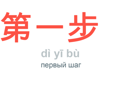
Chinese is not English, and to take the journey of a thousand steps, the first step must be intriguing. Learning Chinese at LOCAL POINT is a blend of grammar, phonetics, character writing, and culture, where the boundaries between studying and enjoyable activities blur.
Open space
...for true sinologists. To reach the victorious end, motivation and support are essential — we create a comfortable atmosphere and encourage students to overcome challenges.
- EventsEvery month, we host open events that anyone can attend: tea ceremonies with authentic Chinese tea, screenings of cartoons and movies in Chinese. We also discuss topics like choosing a university and planning trips.
Get an invitation >> - After-school careThe opportunity to stay after class to complete homework. If it’s hard to focus or you lack motivation and the support of other students at home, get ready for lessons after school in our cozy space.
- Cultural immersionWe organize trips for students to Chinese cultural exhibitions, visit authentic Chinese restaurants in Moscow that only sinologists know about, and several times a year, we invite students to join us on trips to China, where local guides will take them to places that group tourists never reach.
- VictoryEvery year, the top 3 students are awarded a trip to Beijing!


Education
Each course is tailored to the age-related characteristics of information perception and divided into levels: Beginner, Basic, Intermediate, Advanced. Classes last 60/90 minutes and are held 4/8 times per month.
Chinese for Grades 5-7
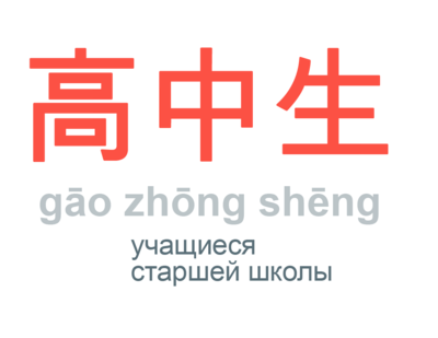
Chinese for High School Students
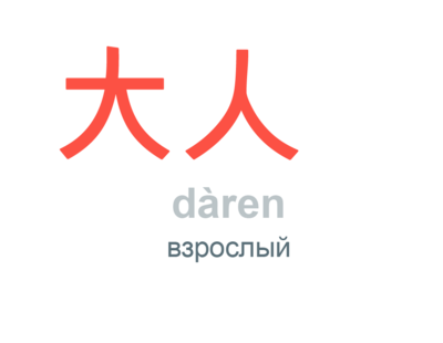
Chinese for Adults
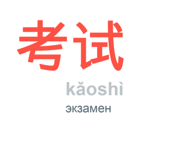
HSK Preparation
Full version of the website: http://local-point.ru/
Since the school was just opening and feedback was already needed, feedback was collected from students of teachers whose tutors they had worked with long before the school opened. In order to get informative insights, a questionnaire was developed, in the questions of which they were asked to characterise the teacher, his/her approach and human qualities, and to describe their personal path of language learning - motivation, starting point, successes. The results were not reviews, but real stories. For those who are too lazy to read the whole text, the key idea is highlighted by the title, it contains both the pain of clients and the expected results. All that remains is to bring photos of different quality to a uniform style using a B&W filter, and where photos were not sent, to put a neutral image.


Key action
A website is not an image tool, it must sell. The key action we expect from a website visitor can be only one. In our case, it is to sign up for a free school event, which does not oblige you to anything, but once you have been in the atmosphere of LOCAL POINT, it is easier to make a final decision about studying here.
Instagram
As part of the content strategy, the tone of the posts, topics, headings, hashtags and information for filling out the profile were worked out.
Taking into account the fact that Victoria will be managing social media herself for the first time, the simplest possible way of post design was chosen, because there is nothing worse than crooked headlines over chaotic photos. The general principle of selecting visual content was developed: a uniform colour scheme for photos, branded backgrounds for informational and sales posts.
Taking into account the fact that Victoria will be managing social media herself for the first time, the simplest possible way of post design was chosen, because there is nothing worse than crooked headlines over chaotic photos. The general principle of selecting visual content was developed: a uniform colour scheme for photos, branded backgrounds for informational and sales posts.


Alternate China photos, teacher portraits and branded backgrounds with titles to create a checkerboard order in the account. Branded element: rounding the corners. Only one accent in each photo. Dusty colours: pastels, dusty greys, blues, muted greens, lots of light, red detail.
Current Account: @localpoint.ch
I am a picky person - if I do it, I do it well. I have collaborated a lot with different kinds of designers, but the previous works did not end or even start well. It was important that we heard each other.
You are adaptable and loyal to the client - that's a big plus. I liked the fact that even after the job was finished I could pelt you with my questions and you answered them meticulously. Respect and a big kudos to you.
I hope this is not our last project!
You are adaptable and loyal to the client - that's a big plus. I liked the fact that even after the job was finished I could pelt you with my questions and you answered them meticulously. Respect and a big kudos to you.
I hope this is not our last project!

Victoria Savkina
LOCAL POINT director

| Best Educational Project In just 1.5 years, Local Point language school made it to the finals of the Project of the Year competition. And in March 2022, Local Point won 🏆 1st place in the Best in Their Field award by Opora Russia in the Education & Leisure category in the Moscow region. |